The use of color in data visualization
While I was working on one of my last visualizations, I needed much time than I expected because the incorporation of colors was extremely complicated.
Here a small analysis about the reasons behind the fails to obtain a good visualization.
The data
The visualization is based on the stats about multiple births along the last three decades. This data presents a high range with very large numbers for single births and tiny numbers for triplets, quadruplets, quintuplets births.
First mistake: Wrong selection of colors
I looked for a palette composed by several colors with high contrast between them.
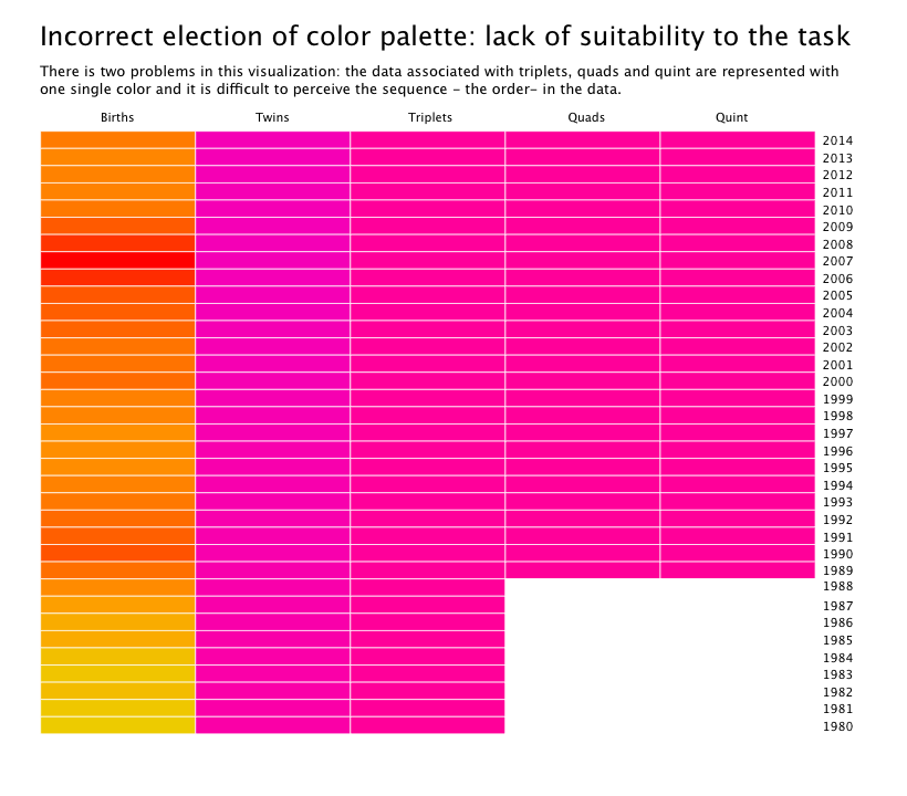
The final result can be seen below these lines:
- Colors are bright and cheerful not too neon: they attract the attention of the reader.
- Information for multiple births (triplets, quadruplets and quintuplets) are represented by one single color.
- Lost of data because the visualization is saying: it’s the same number for triplets, quads and quint. -Not!-

Second mistake: Misrepresentation of data
I change the palette, choosing the palette Blues from Rcolorbrew, in this case there is a difference between each group but it’s not enough because for each year the quantity of the births change and the visualization is not showing that.

To help me in the election of the lighter color based on a specific color, the best tool that I found was: http://www.color-hex.com
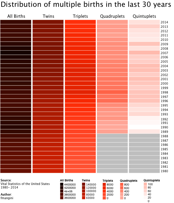
Final visualization
I chose a palette with few colors but with high contrast between them, simplify the design without extra columns for years, change for a more clear typography… And this is the result:

Conclusions
The process of creating a visualization has many moments: choose the dataset, perform an exploratory analysis, choose among all the information which is the story to highlight, but also there is a final moment and that moment is the edition task, the right choice of colors and typography.
After having gone through all the previous code work, it is understandable that we want to escape to edit and look for colors, maybe because we see it as a very minor task, however, the final edition is what allows us to work in attracting the attention of the reader and that the story we want to tell is heard.