Tag / ggplot2
-
Is there a relationship between teacher salary and their student’s SAT scores?
Among some of the amazing talks from Cognitive Systems Institute Group Speaker Series, one of the most wonderful is the talk made by Mine Cetinkaya-Rundel about “Teaching Data Science”. One of the examples presented by her was about the salary teachers and the relationship with the SAT. In this very simple example, we can apply linear regression,…
-
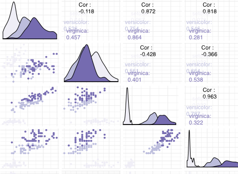
How to show correlations between variables?
When we work with linear regression we need to understand the relationship between the variables, that is, which variables depend on others, for this we analyze the correlation between the different variables that make up our dataset. Below is an example using ggally one of the many libraries that allow us to perform this analysis…
-
How to create a Heatmap (II): heatmap or geom_tile
Heatmaps visualise data through variations in colouring. There are different functions to create a heatmap, one of them is using the heatmap function, but it is also possible to create a heatmap using geom_tile from ggplot2. The election for one of these function relies on the dataset. Below there is an example developed step by…
